A series of articles featuring personal observations about color and design.
I've had a love of color my entire life. When I was a child, Sunday nights found me in front of the console TV mesmerized by Walt Disney's Wonderful World of Color. The opening to that show strikes me now as more than a little psychedelic with sudden splashes of color, and faces blossoming into wild kaleidoscopic images. A carousel of color, indeed. I spent hours in my room listening to music and drawing and coloring with crayons. Decades later, I discovered the biggest box of crayons in Pantone's Color-Finder tool.
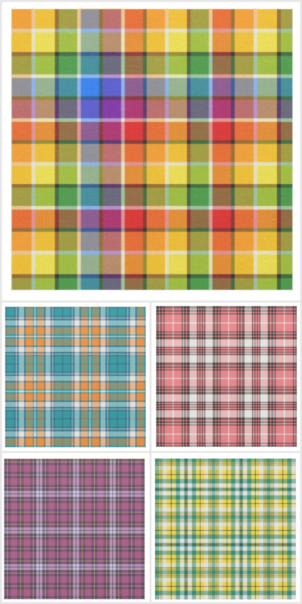
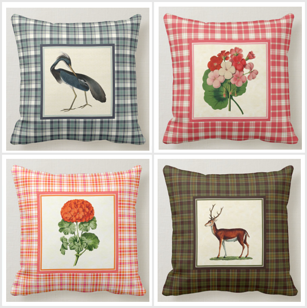
In 2013 when the concept of Plaidwerx was still perking between my ears I became aware of the Pantone Color Institute's color trends reports. (I am always late to the party.) The Spring/Summer 2013 colors had just been released and I was fascinated by some of the color combinations. I'd written a tutorial on Color Theory in 2002 for a website award site, and began picking out complementary, analogous, and triadic harmonies. I immediately began designing plaid patterns.

Pantone Spring-Summer 2013 Fashion Color Trends
Plaidwerx 2013 Fashion Plaids
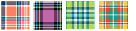
When I started working toward making Plaidwerx a reality, my intention was to design only original plaid patterns, basing them on color trends, seasonal combinations, common school colors combinations, and inspiration drawn from modern art and vintage illustration. My initial decision to not work with Scottish tartans - despite my heritage and love of all things Scots - did not last long, as requests from visitors to my site and shops started coming in. Now Scottish tartans make up the majority of the designs in my shops, and my original tartans make up the majority of designs on my hard disk.
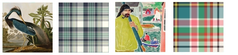
Art-inspired plaids: (Left) Louisiana Heron, John J. Audubon; (right) Blue Water Fisherman, B.J.O. Nordfeldt
Recently I've been drawn back into the world of Pantone colors and palettes. A big part of this is due to a much-needed living room refresh. I decided to frame and hang colorful vinyl album covers from my ancient collection, and of course those fantastic 12 x 12" pieces of art gave birth to a color palette that I've incorporated into further decor updates, and probably - eventually - some plaid patterns as well.
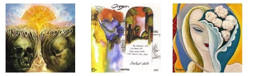
Living room refresh album covers: Moody Blues, Oregon, Derek and the Dominos

Living room refresh color palette
I have, once again, fallen down the rabbit hole of Pantone color, and may need a lifeline to pull me out. But not yet ... there are more ideas perking, more palettes calling my name.
November 9, 2020
Next article: Color of the Year 2021 »