A series of articles featuring personal observations about color and design.
« Previous article: Color of the Year 2021
Pantone revealed the New York Fashion Week Spring/Summer 2022 Fashion Color Trend Report yesterday (September 9) and, as usual, my brain immediately started trying out color combinations for plaid patterns.

Row 1: Northern Droplet, Basil, Harbor Blue, Skydiver, Glacier Lake, Spun Sugar, Dahlia, Innuendo
Row 2: Poinciana, Daffodil, Gossamer Pink, Perfectly Pale, Coca Mocha, Poppy Seed, Snow White
Sidenote: I think there should be a word for the opposite of fashionista that's less derogatory than "slob." For decades I've lived my life in jeans and tees (or sweaters in cooler weather) and Rockports. I don't wear make-up, and don't own a pair of heels. However, that doesn't mean I can't, and don't, appreciate fashion - especially the creativity of design - that goes into it.
Sidenote2: A curiosity driven search for "antonym of fashionista" has revealed that I'm not actually a slob, I'm a scruffmuffin. That's slightly better. Maybe. (Thank you word hippo.)
Moving on. In a quick glance at this latest Pantone palette, the color I typically would gravitate to would be Basil. Green - many shades thereof - has been my favorite color since I was a child; my clothing, linens, and home decor have reflected this throughout the decades. And while I still like it for its soothing and comforting qualities, I have recently added some fresh pops of color to my living space (Living Room Refresh), and am now leaning toward Skydiver as my favorite color in this mix. Basil may still be the most flexible - it can be paired happily with any other color in this report - but the highly saturated Skydiver has a depth and pop that Basil is lacking. That said, I wouldn't be surprised to see Basil named as the Color the Year for 2022.
There are several pastels in the mix here, and many highly saturated popping colors, but what draws my eye is the inclusion of Poppy Seed and Snow White. Years ago I started a "B&W+1" (Black and White Plus One) line, because the pairing of dark and light neutrals with one color creates natural contrasts in a pattern. Most people have a favorite color, or a color that repeats throughout their house to tie their home decor together, so B&W+1 seemed like an idea worth following through on. (And someday, perhaps I will.)
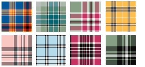
Overall, I admit I'm not very inspired by the colors in this report, and so I've turned to Johannes Itten's basic color theory harmonies to choose the colors in the plaid pattern samples below: Triadic, Analgous, Complementary, and Monochromatic (B&W+1).

September 10, 2021
Next article: Waiting for Spring 2024 »